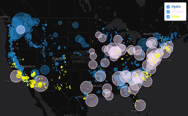
The map visually represents the sizes of power plants based on their total electric capacity output, allowing for easy comparison. To refine the displayed data, users can utilize the fuel filters list located in the top right corner. By clicking on the map, a 500km radius of power plants in the selected area is revealed, and a popup window displays the cumulative energy output for the entire region. Additionally, within the 500km range, clicking on an individual circle provides specific data for that particular power plant. This interactive map offers comprehensive insights into the distribution and energy output of power plants.